I’ve heard a lot about the CSO’s r package used to pull data directly to R, but to date I haven’t tried it. I decided to take a look recently after having some trouble downloading the data and trying to move it from Excel into Stata or R, and then back into Word. It turns out the package is pretty easy to use and lets you simplify workflow quite a bit. I think it’s especially good for blogging, because it makes write up quick and pain free. In this post I want to take a look at LFS data as a way of showing how easy getting some graphs up using the library.
Load the data
You can learn more about the package here, including some of the more specific commands, in this example I want to run a quick analysis on employment figures using the LFS.
#install.packages('csodata')


library(csodata)
library(tidyverse)
library(lubridate)
One you load the package, getting the data you need is pretty simple. Just use the cso_get_data() command.
For this post, I went to the CSO’s website and found some LFS figures here.
Once I had the relevant code, I was able to pull the data straight into RStudio.
tbl1 <- cso_get_data("QLF01") %>%
  tbl_df()
Reshape
Now that I have the data in place, I can reshape in using dplyr().
I can also parse the time measure, and save it as a tibble.
tbl1 <- tbl1 %>%
  gather(c(-Statistic, -Sex, -ILO.Economic.Status),
         key='year',
         value='value')

tbl1$year <-   parse_date_time(tbl1$year, orders= "Yq")

tbl1 <- tbl_df(tbl1)
Graph
Now I can pick and chose which aspects of the data to use in a graph using ggplot().
If I want a general graph of employment data, I can specif this using dplyr() and then combine using %>%.
tbl1 %>%
  select(-Statistic) %>%
  filter(Sex == "Both sexes",
         ILO.Economic.Status == "In employment") %>%
  ggplot(aes(x=year,y=value))+
  geom_point()+
  geom_line()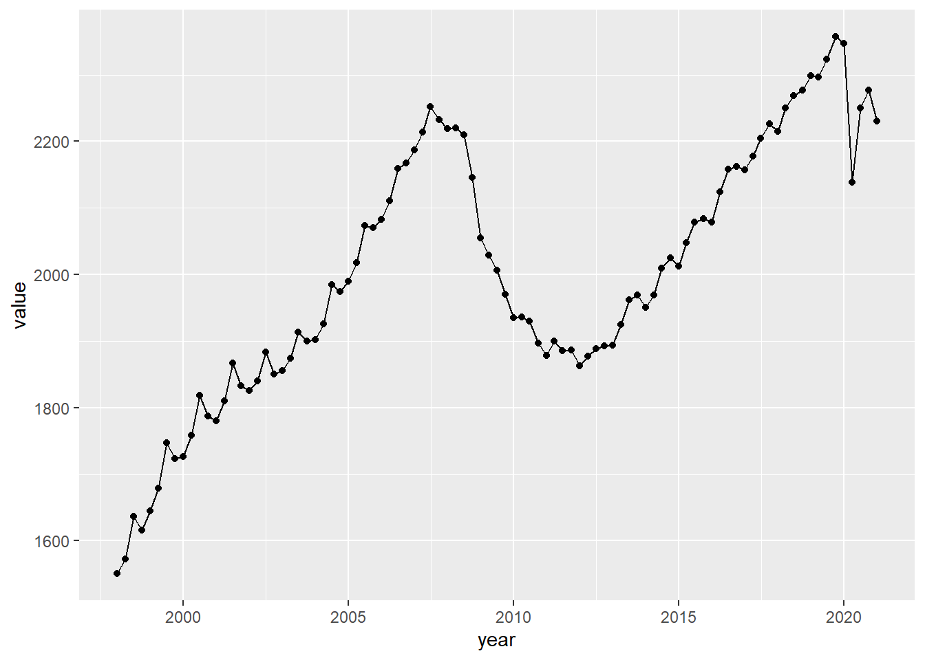
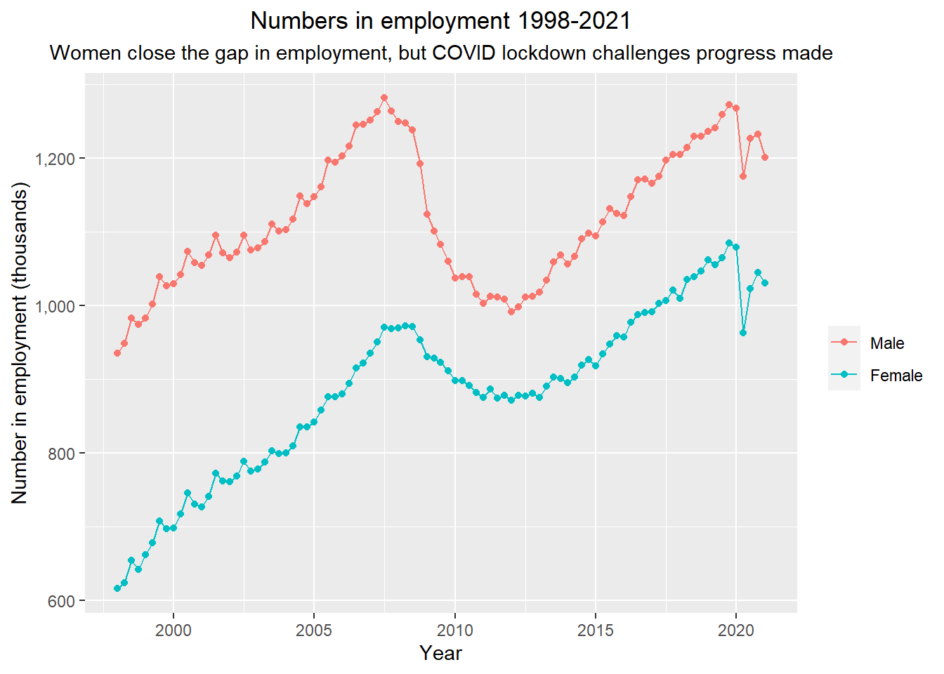
This makes it easy to run a quick graph, but just as easily, I can split graphs by dimensions using dplyr().
For example by splitting things by gender.
tbl1 %>%
  select(-Statistic) %>%
  filter(Sex != "Both sexes",
         ILO.Economic.Status == "In employment") %>%
  ggplot(aes(x=year,y=value, col=Sex))+
  geom_point(aes(col=Sex))+
  geom_line(aes(col=Sex))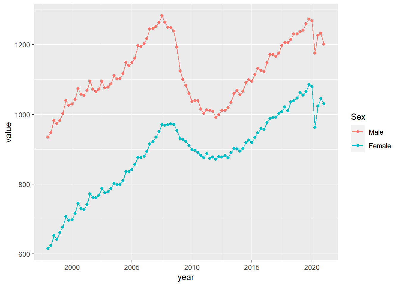
As usual, you can also customise graphs and commands to make them more appealing and easier to interpret using ggplot().